
엑소더스_큐입니다.
천고마비의 이 아름다운 계절에...[퀵패널]에 대해 살짝 파헤쳐 보겠습니다.
[갤럭시노트1_4.1.2_MJ1_Deodex]기준으로 설명하겠습니다.(간간히 노트4 도 등장할겁니다.)
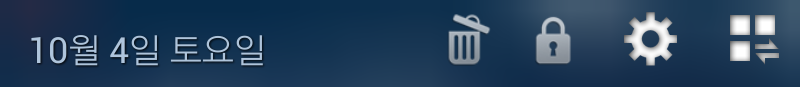
1.퀵패널-헤드
-SystemUI.apk/res/layout/tw_status_bar_expanded_header.xml

[헤드 전체 배경]
<LinearLayout android:gravity="left" android:orientation="horizontal" android:background="#ff006678"...
-android:background="#ff006678" 이 색상코드가 퀵패널-헤드의 배경을 지정합니다.
아니면,android:background="@drawable/..."이렇게 이미지로 배경을 지정한 구문도 있을수 있습니다.
그럴경우, 해당 drawable폴더에 있는 그 이미지가 퀵패널-헤드의 배경이 되는것입니다.
사용자의 입맛에 따라 색상코드로 하든, 이미지로 하든, 수정하면 됩니다.
-중요하게 눈여겨 볼 구문은,
퀵패널-헤드의 배경을 색상코드로 했을때 "#" 이 기호 다음에 붙는 첫머리 숫자(또는 알파벳) 두자리가 색상의 "투명도"를 나타냅니다. 또한, xml에서의 모든 색상코드는 맨앞에 #가 붙고 그다음에 투명도값 두자리, 그리고 그 뒤에 색상코드 6자리 숫자(또는 알파벳)로 구성되어 있습니다.
<투명도값>
100%-00
90%-1a
80%-33
70%-4d
60%-66
50%-80
40%-99
30%-b3
20%-cc
10%-e6
0%-ff
#노트4_퀵패널 헤드 배경.(SystemUI.apk/res/layout/status_bar_expanded_header.xml)
<RelativeLayout android:gravity="center_vertical" android:orientation="horizontal" android:id="@id/header" android:background="@drawable/notification_header_bg"
이와 같이 노트4에서는 색상코드가 아닌 "notification_header_bg" 이미지 파일을 배경으로 지정하고 있습니다.
[시계]
<com.android.systemui.statusbar.policy.Clock android:textAppearance="@style/TextAppearance.StatusBar.Expanded.Clock"...
이 구문대로라면 SystemUI.apk/res/values/styles에서 퀵패널-헤드의 시계 관련 세부내용을 지정하도록 돼있지만,
tw_status_bar_expanded_header.xml에서도 직접 입력/수정이 가능합니다.
-시계 색상:android:textColor="#ffffffff"
(앞에서도 설명했지만 #ff(투명도)를 제외한 뒷 6자리숫자(또는 알파벳)가 실제 글자를 나타내는 색상코드입니다.
;디컴파일한 상태에서 작업하다가 색상코드 앞에 "#" 이 기호를 빼먹고 컴파일 하는 경우가 가끔 있을겁니다.
그럴땐 무조건 컴파일 21오류가 발생합니다.꼭 확인하시고 컴파일 하시기 바랍니다.
-시계 크기:android:textSize="22.0dip"
(dip를 제외한 앞에 22.0 숫자가 크기를 나타내는 숫자입니다.)
TIP:
시계나 날짜를 퀵패널-헤드에서 "안보이게"하기 위한 여러가지 편법이 있는데 그중에 많이들 사용하는 방법이 android:textSize="0.0dip" 이겁니다.글자 크기를 제로로 만들어 버리는겁니다.
또는, 글자가 놓인 레이아웃의 세로를 제로로 만드는겁니다.android:layout_height="0.0dip"dlp 이렇게 말입니다.
아니면,android:layout_width="0.0dip" 이렇게 가로를 제로로 만들어도 됩니다.
간혹, android:textColor="#00ffffff"이렇게 색상코드에서 투명으로 해도 안되느냐고 고집부리는(?)분들이 계시는데, 그럴 경우 글자는 안보이긴 한데 그 공간은 그대로 차지하게 됩니다. 그럼 어떻게 될까요~?...정체모를 빈공간이 꼴뵈기 싫게 퀵패널-헤드에 떡~하니 자리잡고 있겠죠.
이 방법은 꼭 시계나 날짜가 아니더라도 어떤 특정한 이미지나 text를 아예 없애는게 아닌 "안보이게"할때 주로 쓰는 방법입니다.
-android:layout_marginLeft="10.0dip"
android:layout_marginBottom="4.0dip"
android:layout_marginRight="5.0dip"
android:layout_marginTop="4.0dip"
그리고 이런 구문들이 있습니다.
이 구문들은 퀵패널-헤드에만 있는게 아니고 대부분의 xml에 들어있는 구문들입니다.
이 구문들은 한마디로 "상하좌우 여백"을 나타내는 구문입니다..
:예를 들어, 퀵패널-헤드의 시계(text)를, 놓여있는 기본공간(layout)범위내에서 좌우측 또는, 아래위 빈공간 여백(margin)을 얼만큼 줄것이냐 지정하는 구문입니다. 퀵패널-헤드에서 시계나 날짜가 서로 어울리지않게 삐딱하게 보일 경우, 이 구문의 값을 수정하여 바로 잡을수 있습니다.
이 구문과 유사한 android:layout_PaddingLeft="10.0dip"와 같은 Padding이 붙은 구문이 있는데 이것은 margin과는 조금 다른 개념입니다. 시계가 놓여진 공간(layout) 전체를, 상하좌우측의 어떤 아이템이나 시작과 끝점에서 얼마만큼 간격을 주고 위치 시키느냐를 지정해주는 구문입니다.
-android:layout_width="wrap_content":가로
-android:layout_height="wrap_content":세로
-android:id="@id/clock"
이것은 말그대로 시계 레이아웃을 하나의 id로 정의해주는 겁니다.
이와 같이 어떤 아이템을 특정 id로 지정할 경우, res/values/ids.xml에 <item type="id" name="clock">false</item>이렇게 해당 id 이름을 넣어서 반드시 추가해줘야 합니다.
-systemui:ampmSmall="true"
이것은, 시계 옆에 붙은 "오전/오후"글자를 작게 표시한다는 구문입니다.
상단바 시계 옆에 "오전/오후"를 작게 표시할때도 이 구문을 추가하면 됩니다.
-android:singleLine="true"
이것은 시계글자를 "한줄"로만 나타나게 한다는 구문입니다.
TIP:시계나 날짜를 비롯한 text를 두줄 이상 보이게 할때는, android:singleLine="false" 이렇게 정의해주고, 그뒤에 android:maxLines="6"와 같은 구문을 추가하여 "최대 몇줄"까지 할것인지를 숫자로 그 값을 지정해주면 됩니다.(잠금화면 "분실시 연락처"같은 레이아웃에 적절히 응용하면 좋습니다.)
-android:shadowColor="#50000000" android:shadowDx="1.0" android:shadowDy="1.0" android:shadowRadius="2.75"
이것은, 주로 시계나 날짜등 글자(text)레이아웃에 추가해주는 구문인데,쉽게 말해서 text에 "그림자효과"를 주는 겁니다.흰색 글자가 흰색 바탕위에서도 잘보이게 하거나 글자 자체를 좀 더 뚜렷하게 잘 보이게 하기 위한 구문입니다.여기서도 역시 #뒤에 두개의 숫자(또는 알파벳)가 투명도값입니다.
#노트4_시계.(status_bar_expanded_header.xml)
<com.android.systemui.statusbar.policy.Clock android:textAppearance="@style/TextAppearance.StatusBar.Expanded.Clock" android:textColor="@color/notification_header_clock_color" android:gravity="bottom" android:id="@id/clock" android:layout_width="wrap_content" android:layout_height="wrap_content" android:singleLine="true" android:layout_marginStart="@dimen/notification_panel_header_clock_margin_left" systemui:ampmSmall="true" />
-못보던 구문이 하나 있습니다.
android:layout_marginStart="@dimen/notification_panel_header_clock_margin_left"
[날짜]
<com.android.systemui.statusbar.policy.DateView android:textAppearance="@style/TextAppearance.StatusBar.Expanded.Date"...
이것 역시 res/values/styles.xml에서 세부항목을 정의하도록 돼있지만, tw_status_bar_expanded_header.xml에서도 직접 입력/수정이 가능합니다.날짜의 색상과 크기 수정에 관한건 위에 시계와 똑같습니다.
-android:layout_gravity=bottom"
이것은 DateView레이아웃에 있는 날짜가 표시되는 위치를 해당 레이아웃내에서 상하좌우 어느쪽으로 "쏠리게" 해줄건가~...그걸 지정해주는 구문입니다. 이와 유사한 android:gravity="center"이런 구문이 있는데, 이것은 어느 특정 레이아웃 전체를 상하좌우 어느 위치로 할것인가를 지정해주는 구문입니다,주로 "잠금화면쪽 시계"같은걸 수정할때 이 구문이 반드시 들어가곤 합니다.
:예를 들어 잠금화면쪽 시계 레이아웃을 보면 아래와 같이 돼있는데,
<LinearLayout android:gravity="center" android:orientation="vertical" android:id="@id/clock_time_and_date"...
여기서 android:gravity="center"로 해주면 잠금화면에서 시계가 통째로 가운데에 위치하게되고,
android:gravity="left" 이렇게 하게되면 시계가 통째로 좌측으로 위치하게 해주는 구문입니다.
만약에 저 구문이 기존 레이아웃에 없을 경우는, 꼭 필요한 경우가 아닌 이상 일부러 추가할 필요는 없습니다.
#노트4_날짜.(status_bar_expanded_header.xml)
<com.android.systemui.statusbar.policy.DateView android:textAppearance="@style/TextAppearance.StatusBar.Expanded.Date" android:textColor="@color/notification_header_date_color" android:ellipsize="none" android:gravity="bottom" android:id="@id/date" android:layout_width="wrap_content" android:layout_height="fill_parent" android:layout_marginBottom="@dimen/notification_panel_header_date_margin_bottom" android:singleLine="true" android:layout_marginStart="@dimen/notification_panel_header_date_margin_left" android:layout_marginEnd="@dimen/notification_panel_header_date_margin_right" android:layout_toEndOf="@id/clock" />
-android:layout_toEndOf="@id/clock"
이것은, 날짜 레이아웃을 시계 레이아웃 "끝"에 표시한다는 구문입니다.
이와 유사한 android:layout_toLeftOf="...." 이런 구문들도 있는데, "...."이것의 왼쪽에 해당 아이템을 위치시킨다~..그런 개념입니다.
[셋팅/토글 버튼]
<LinearLayout android:id="@id/settings_button" android:background="#00006678"...
<LinearLayout android:id="@id/toggles_button" android:background="#00006678"...
이건 뭐 다들 잘 아시는 퀵패널-헤드 우측에 몰려있는 버튼 두개를 말합니다.
-@id/settings_button 이건, 퀵패널-메인을 나타내는 버튼.
-@id/toggles_button 이건 "확장토글"을 나타내는 버튼입니다.
...그외 별 특이사항이 없어서 그냥 넘어갑니다.
#노트4_셋팅/토글 관련 버튼.(status_bar_expanded_header.xml/노트4는 4개가 있네요.)
<ImageView android:id="@id/basic_settings_button" android:background="@drawable/ic_notify_button_bg"...
<ImageView android:id="@id/settings_edit_button" android:background="@drawable/ic_notify_button_bg"...
<ImageView android:id="@id/settings_button" android:background="@drawable/ic_notify_button_bg"...
<ImageView android:id="@id/notification_button" android:background="@drawable/ic_notify_button_bg"...
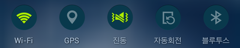
2.퀵패널 셋팅 버튼.
-SystemUI.apk/res/layout/tw_quick_setting_button.xml
대부분의 구문들이 앞에서 설명한 시계나 날짜 레이아웃에 있는것과 같거나 비슷합니다.

-첫머리에 <LinearLayout android:orientation="vertical"...이렇게 시작되는데,
여기서 android:orientation="vertical" 이 구문은, quick_setting_button에서 구성되는 각 아이템들을 "수직방향/vertical"으로 나열시킨다는 의미입니다. 만약에 android:orientation="horizontal" 이렇게 해주면 "수평방향-horizontal"으로 나열되게 합니다.
여러분이 지금 실제 보고있는 폰의 퀵패널에 보이는것과 같이,
<ImageView android:layout_gravity="center" android:id="@id/btn_image"...버튼 이미지
<TextView android:textSize="@dimen/quick_setting_button_text_size"...이미지 밑 글자
<ImageView android:layout_gravity="center" android:id="@id/btn_status_image"...ON,OFF 이미지
이렇게 순서대로(수직 방향) 나열돼 있습니다.
-android:layout_gravity="center"
이미 위에 날짜에서 설명했듯이 각각의 이미지나 글자를 해당 레이아웃내에서 정가운데로 위치시킨다는 구문입니다.
-android:layout_height="@dimen/quick_setting_button_image_height"
세로(height)범위를 해당 xml이 아닌 다른곳(dimen)으로 지정해두고 있는데, 다른 xml에도 이런 구문들이 매우 많습니다.
그럴경우 헷갈릴 필요없이 지정한 곳을 찾아 열어보면 됩니다.
-android:layout_height="@dimen/quick_setting_button_image_height" 이라고 지정을 했으니까 res/values에 있는 dimens.xml을 열어보면 됩니다. res/values/dimens.xml을 열어보면,<dimen name="quick_setting_button_image_height">44.0dip</dimen>이렇게 그 구문이 있고, 세부적인 값이 표기되어 있습니다.
-ON,OFF 이미지 안보이게 하기.
<ImageView android:layout_gravity="center" android:id="@id/btn_status_image"...이 레이아웃에서 android:layout_height="0.0dip" 이렇게 해주면 ON,OFF이미지가 퀵패널 셋팅 버튼 공간에서 안보이게 됩니다.
TIP:
퀵세팅 버튼과 관련된 수치값은 대부분 SystemUI.apk/res/values/dimens.xml에 있습니다.(제 노트1 구문입니다.)
<dimen name="quick_setting_button_height">76.0dip</dimen>
<dimen name="quick_setting_button_image_height">44.0dip</dimen>
<dimen name="quick_setting_button_text_height">30.0dip</dimen>
<dimen name="quick_setting_button_text_size">10.0dip</dimen>
<dimen name="quick_setting_button_status_height">0.0dip</dimen>
<dimen name="quick_setting_button_status_padding">2.0dip</dimen>
<dimen name="quick_setting_button_margin_top">6.0dip</dimen>
이 부분은, 사용자의 기호에 따라 선택의 폭이 다양하기 때문에 각자 자신이 원하는 스타일에 맞게 수정하면 됩니다.
-퀵세팅 버튼 이미지.
노트1같은 경우,SystemUI.apk/res/drawable-xhdpi폴더와 drawable-sw360dp-xhdpi폴더에 다 들어 있습니다.
tw_quick_panel_icon_...이렇게 시작되는 버튼 이미지 이름들이 쭉 나열돼 있습니다.
이것 역시 사용자의 기호에 따라 아주 다양한 이미지로 수정하면 됩니다.
(노트4도 비슷하게 drawable-xxxhdpi와 drawable-sw360dp-xxxhdpi에 들어 있습니다.)
#노트4_퀵셋팅 버튼.(tw_quick_setting_button.xml)
<View android:id="@id/btn_divider" android:background="@drawable/quick_setting_button_divider_bg" android:layout_width="@dimen/quick_setting_button_divider_width" android:layout_height="@dimen/jbp_quick_setting_button_height" />
<LinearLayout android:gravity="center_vertical" android:orientation="vertical" android:id="@id/quick_setting_btn_text_image" android:focusable="false" android:layout_width="fill_parent" android:layout_height="@dimen/jbp_quick_setting_button_height">
<ImageView android:layout_gravity="center" android:id="@id/btn_image" android:layout_width="fill_parent" android:layout_height="@dimen/jbp_quick_setting_button_image_height" android:layout_marginTop="@dimen/jbp_quick_setting_button_margin_top" />
<TextView android:textSize="@dimen/quick_setting_button_text_size" android:textColor="@color/quick_setting_btn_text_color" android:gravity="center" android:id="@id/btn_text" android:layout_width="fill_parent" android:layout_height="@dimen/quick_setting_button_text_height" android:layout_marginTop="@dimen/quick_setting_button_text_top" android:includeFontPadding="false" android:lineSpacingExtra="@dimen/quick_setting_button_text_line_gap_size" />
<ImageView android:layout_gravity="center" android:id="@id/btn_status_image" android:paddingLeft="@dimen/quick_setting_button_status_padding_left" android:paddingTop="@dimen/quick_setting_button_status_padding_top" android:paddingRight="@dimen/quick_setting_button_status_padding_right" android:paddingBottom="@dimen/jbp_quick_setting_button_status_padding_bottom" android:layout_width="fill_parent" android:layout_height="@dimen/quick_setting_button_status_height" android:scaleType="fitXY" android:drawable="@drawable/tw_quick_panel_off" />
</LinearLayout>
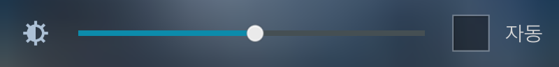
3.밝기슬라이더.
-SystemUI.apk/res/layout/tw_status_bar_expanded.xml
<LinearLayout android:orientation="vertical" android:id="@id/brightness_controller"...

밝기슬라이더 쪽은 배경을 투명처리 할거냐 말거냐 하는 부분만 잘 신경써서 처리하면 됩니다.
-android:background="#00003d47"...저는 밝기슬라이더 배경을 100%투명처리 해둔 상탭니다.
-밝기슬라이더에 보면 흔히들 "프로그레스바"라고 부르는 이미지가 놓여져 있습니다.
그리고 Scrubber_control이라고 불리는 동그란 아이콘도 그 속에 포함되어 있습니다.
근데, 그 이미지들은 SystemUI.apk파일에 있지않고 framework-res.apk파일에 있습니다.
프로그레스바 수정하기위해 SystemUI.apk 아무리 뒤져봐야 없으니까 참고하시기 바랍니다.
#노트4_밝기슬라이더.
<LinearLayout android:orientation="vertical" android:id="@id/brightness_controller" android:layout_width="fill_parent" android:layout_height="wrap_content">
<com.android.systemui.statusbar.policy.ToggleSlider android:layout_gravity="center_vertical" android:id="@id/brightness_slider" android:background="@color/toggle_slider_background_color" android:layout_width="fill_parent" android:layout_height="@dimen/toggle_slider_height" systemui:text="@string/status_bar_settings_auto_brightness_label" />
<View android:background="@color/toggle_slider_divider_color" android:layout_width="fill_parent" android:layout_height="1.0dip" />
</LinearLayout>
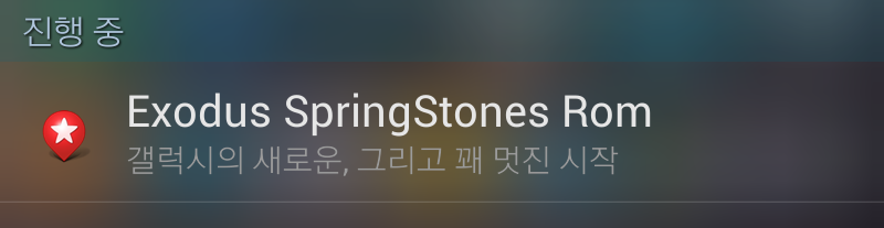
4.퀵패널 진행중/알림.
-SystemUI.apk/res/layout/tw_status_bar_expanded.xml

<LinearLayout android:orientation="vertical" android:id="@id/noNotificationsTitle"...알림없음
<LinearLayout android:orientation="vertical" android:id="@id/onGoingCart"...진행중
<com.android.systemui.statusbar.policy.NotificationRowLayout android:id="@id/onGoingItems"
<LinearLayout android:orientation="vertical" android:id="@id/notificationCart"...알림
android:id="@id/latestNotificationText"
android:id="@id/clear_all_button"...지우기
-여기서도 크게 중요하게 따로 다룰 구문은 없습니다.
퀵패널의 "진행중/알림" 같은 글자들의 색상이나 크기, 그 배경을 지정해주는게 전부입니다.
-각 레이아웃을 살펴보면 android:background=다음에 색상코드가 아닌, "@drawable/....." 이렇게 이미지를 배경으로 지정한 구문들도 있습니다.
예로;갤럭시노트4-SystemUI.apk/res/layout/status_bar_expanded.xml에 보면,
android:id="@id/noNotificationsTitle" android:background="@drawable/notification_title_background"...
. 이것은 @id/noNotificationsTitle배경을 색상코드가 아닌 drawable폴더에 있는 notification_title_background.9.png이미지로 한다는 개념입니다. 실제 노트4-SystemUI.apk/res/drawable-xxxhdpi폴더에 tw_notification_title_background.9.png 이미지가 그것들의 배경인 셈입니다.
TIP:
"알림창"을 투명으로 하려는 분들이 많습니다.
SystemUI.apk/smali/com/android/systemui/statusbar/phone/PhoneStatusBar.smali에서
const/high16 v15, -0x100 이런 구문이 두개 있습니다.
const/high16 v15, 0x0 이렇게 두 구문을 수정하세요.
#노트4_진행중/알림...(status_bar_expanded.xml)
<LinearLayout android:orientation="vertical" android:id="@id/notificationCart" android:background="@drawable/notification_title_background" android:visibility="gone" android:layout_width="fill_parent" android:layout_height="@dimen/status_bar_expanded_notification_category_height">
<RelativeLayout android:orientation="horizontal" android:layout_width="fill_parent" android:layout_height="wrap_content">
<TextView android:textSize="@dimen/status_bar_expanded_notification_category_text_size" android:textColor="@color/notification_category_color" android:gravity="left|center" android:id="@id/latestNotificationText" android:paddingLeft="11.0dip" android:layout_width="@dimen/status_bar_expanded_latest_notification_text_width" android:layout_height="fill_parent" android:layout_marginLeft="@dimen/status_bar_expanded_notification_margin" android:text="@string/status_bar_latest_events_title" android:layout_alignParentLeft="true" />
<ImageView android:id="@id/clear_button_divider" android:background="@color/quickpanel_button_divider_color" android:visibility="gone" android:layout_width="1.0dip" android:layout_height="fill_parent" android:layout_marginTop="4.0dip" android:layout_marginBottom="4.0dip" android:layout_toLeftOf="@id/clear_all_button" />
<TextView android:textSize="@dimen/status_bar_expanded_notification_clear_button_text_size" android:textColor="@color/status_bar_clear_btn_text" android:gravity="center" android:id="@id/clear_all_button" android:background="@drawable/tw_clear_button_bg" android:padding="0.0dip" android:focusable="true" android:visibility="gone" android:clickable="true" android:layout_width="@dimen/status_bar_expanded_clear_button_width" android:layout_height="fill_parent" android:layout_marginRight="@dimen/status_bar_expanded_clear_button_right_margin" android:text="@string/status_bar_clear_all_button" android:layout_alignParentRight="true" android:contentDescription="@string/accessibility_clear_all" />
</RelativeLayout>
</LinearLayout>
5.클로즈바.
-SystemUI.apk/res/layout/tw_status_bar_expanded.xml
<com.android.systemui.statusbar.phone.CloseDragHandle android:layout_gravity="bottom" android:orientation="vertical"...

-네..앞에서 설명했던 구문들이 대부분 들어있지만, 한가지만 확인하겠습니다.
<TextView android:textAppearance="@style/TextAppearance.StatusBar.Expanded.Network"....android:id="@id/carrier_label"...
다들 잘 아시는 퀵패널 클로즈바 위에 나타나는 "통신사 문구" 입니다.
"통신사 문구" 스타일에 관해서는 res/values폴더에 있는 styles.xml에 TextAppearance.StatusBar.Expanded.Network를 찾아 알아봐라~..이런 개념인데 몹시 귀찮지만 한번 시키는데로 찾아봅시다.
<style name="TextAppearance.StatusBar.Expanded.Network" parent="@style/TextAppearance.StatusBar.Expanded">
<item name="android:textSize">14.0dip</item>
<item name="android:textStyle">normal</item>
<item name="android:textColor">#ffffffff</item>
네..보다시피 별건 없고 통신사문구 글자의 크기와 색상을 뭐로 할것인지 styles.xml에서 지정해주고 있습니다.
-<item name="android:textStyle">normal</item>
이것은, 글자(text)의 굵기를 나타냅니다.
normal은 그냥 일반적인 글자 굵기이고, "bold"라고 입력하면 글자가 굵게 표시됩니다.
-통신사 문구를 안보이게 하려면...?
-res/values/styles.xml의 TextAppearance.StatusBar.Expanded.Network에서
<item name="android:textSize">0.0dip</item>이렇게 해도 안보이게 되고,
-SystemUI.apk/res/layout/tw_status_bar_expanded.xml맨 마지막 부분에 있는,
<TextView android:textAppearance="@style/TextAppearance.StatusBar.Expanded.Network"...android:id="@id/carrier_label"...여기서 android:textSize="0.0dip" 이렇게 처리해줘도 통신사 문구는 안보이게 됩니다.
그리고 이 클로즈바의 이미지파일은,
노트1의 경우,SystemUI.apk/res/drawable-xhdpi폴더에 있는 tw_status_bar_close_off.png/tw_status_bar_close_on.png 파일입니다.
#노트4_통신사 문구.(carrier_label_layout.xml)
<LinearLayout android:orientation="vertical" android:id="@id/carrier_label_layout" android:background="@drawable/tw_close_handle_bg" android:layout_width="fill_parent" android:layout_height="@dimen/carrier_label_height"
xmlns:android="http://schemas.android.com/apk/res/android">
<View android:background="@drawable/close_handler_divider" android:layout_width="fill_parent" android:layout_height="0.39999998dip" />
<TextView android:textAppearance="@style/TextAppearance.StatusBar.Expanded.Network" android:textColor="@color/carrier_label_color" android:ellipsize="marquee" android:gravity="center" android:id="@id/carrier_label" android:focusable="true" android:focusableInTouchMode="true" android:layout_width="fill_parent" android:layout_height="fill_parent" android:scrollHorizontally="true" android:singleLine="true" android:marqueeRepeatLimit="marquee_forever" android:fontFamily="sec-roboto-light" />
</LinearLayout>
6.퀵패널 전체 배경.
-SystemUI.apk/res/layout/tw_status_bar_expanded.xml
<FrameLayout android:id="@id/notification_panel" android:background="#ff001d27"...
tw_status_bar_expanded.xml의 첫머리에 있는 구문입니다.
저같이 색상코드로 지정한 경우도 있고, 노트4 같이 android:background="@drawable/notification_background_color" 이렇게 color로 지정돼 있는 경우도 있고, android:background="@drawable/notification_panel_bg" 이렇게 이미지로 지정된 경우도 있습니다.
이것 역시, 사용자의 기호에 따라 각자 스타일대로 지정해주면 됩니다.
다만, 퀵패널의 전체 배경을 투명화 하고자 할때는, 색상코드로 지정해주는게 가장 쉽고 편리합니다.
길고도 지루한 글 끝까지 봐주신 분들 대단히 고맙습니다.^^


